Timeline
10 weeks
Contributors
Cindy Zhao, Hongyi Tang, Moniyat Chowdhury, Ruolin Chen. Judy Nguyen
Role
Lead Designer
Deliverables
High-fidelity mockups + pitch deck
OVERVIEW
In a world where phones are becoming increasingly addictive, joyO(u)S is an operating system aimed to combat excessive phone use and foster healthier relationships with our mobile devices. joyO(u)S promotes mindful & meaningful interactions through more thoughtful. kind & personalized experiences.
PROBLEM BRIEF
Create a completely original mobile operating system and all of its core applications. At the end of 10 weeks, professional designers from industry will review them out of 5 stars.
BRAINSTORMING
After receiving our problem brief my team ran to the whiteboards to generate potential ideas. We found it challenging to come up with concepts on the spot so we pivoted and brainstormed user groups that could benefit from an OS curated for them. From the several groups we came up with, we ultimately chose "People Interested in Mental Well-Being" as each person in the team felt like they could benefit from a healthier relationship with their phones.
THE PROBLEM
Have you ever opened your phone to complete a quick task, perhaps a simple email reply, and before you know it, many hours have passed and you find yourself mindlessly consuming content on the internet? With no surprise, this is a common problem faced by many people and it stems down to the fact that phones are designed to be addicting.
But it doesn't have to be that way. Our phones have many benefits - they allow us to stay connected, to fulfill our jobs, to expand our knowledge, and more! Our team saw the potential of keeping these benefits while minimizing the distractions and asked ourselves,
USER RESEARCH
To gain a better understanding of our user's relationships with their phones, our team conducted semi-structured interviews with 7 college undergraduates. After analyzing our research we determined that users found their phones:
Interviewees described how easy it is to get sucked into using apps to kill time as there are many outlets to waste time on. HOWEVER, they also described how essential phones are to their everyday lives.
In other words, instead of forcing users to stop their phone usage, it is better to focus on encouraging better relationships with phones. With these insights, we felt confident in our problem statement and forged ahead.
USER PERSONAS
We created two personas to guide our design work and referenced them often to ensure our designs were aligned with our user's needs.
DESIGN PRINCIPLES
Based on our user research, we chose 3 design principles that we felt best embodied our users and their needs.
MOOD BOARD
Before creating our own design language, we a mood board of images we felt best matched our principles. We were drawn to screens with pastel colors and soft shapes that produce a feeling of calm.
DESIGN LANGUAGE
Based on our mood board, we developed our own design system to help maintain consistency among our various applications. We chose calming colors, fonts, and icons that would aid in our creation of meaningful and thoughtful experiences.
WIREFRAMES
To ensure uniformity, we decided which applications we were interested in creating and grouped them into app types. From those app types, we derived common design layouts and created wireframes that served as a starting point for our high-fidelity mockups.
DESIGN ITERATIONS
After establishing our design guidelines, we approached creating OS applications by following this process:
I mainly worked on the Lockscreen, Notifications, SpringBoard, Messages, and Health. I also played a key part in the standardization and UI improvements of all applications.
Final Designs
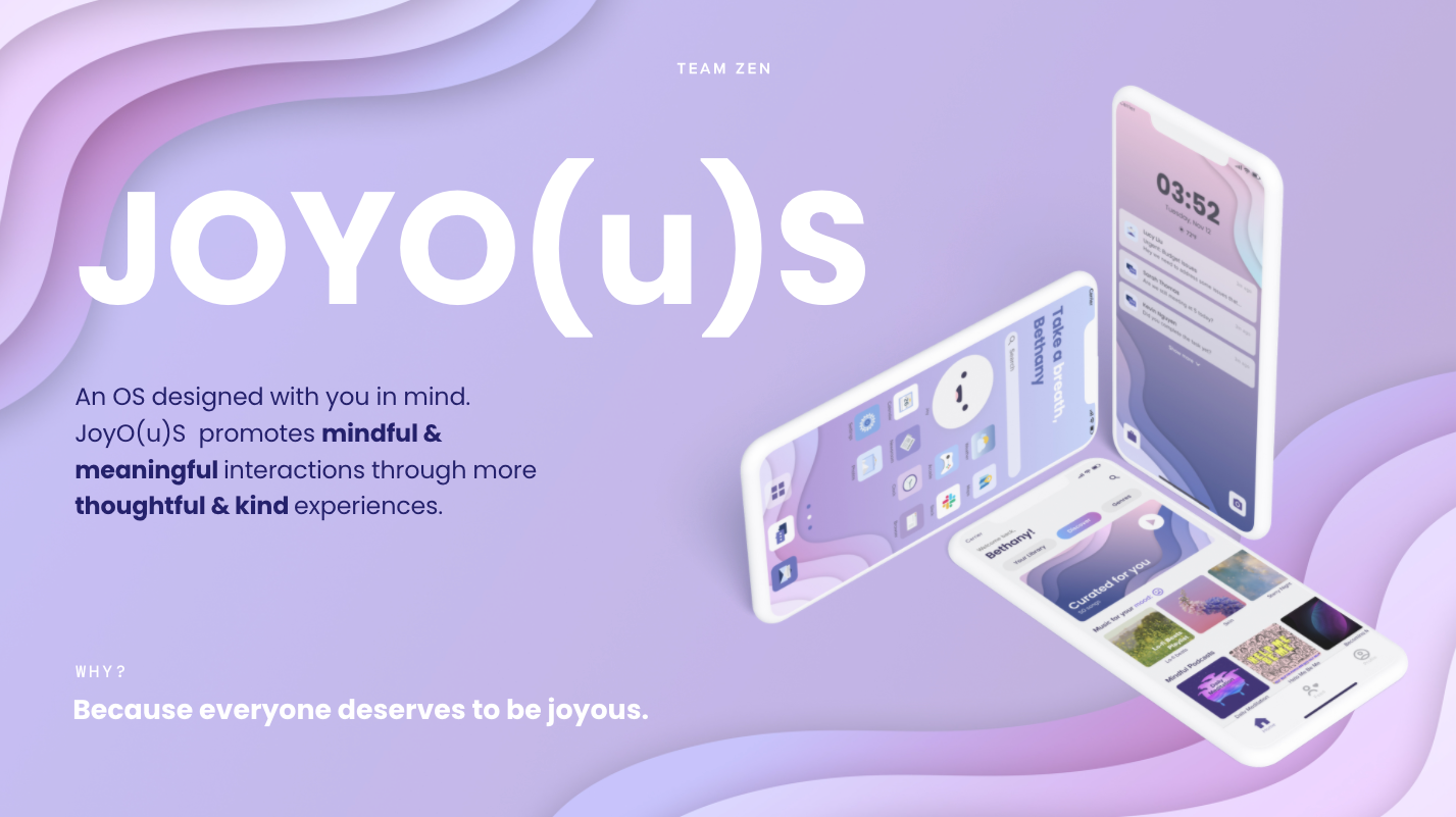
Introducing JoyO(u)S
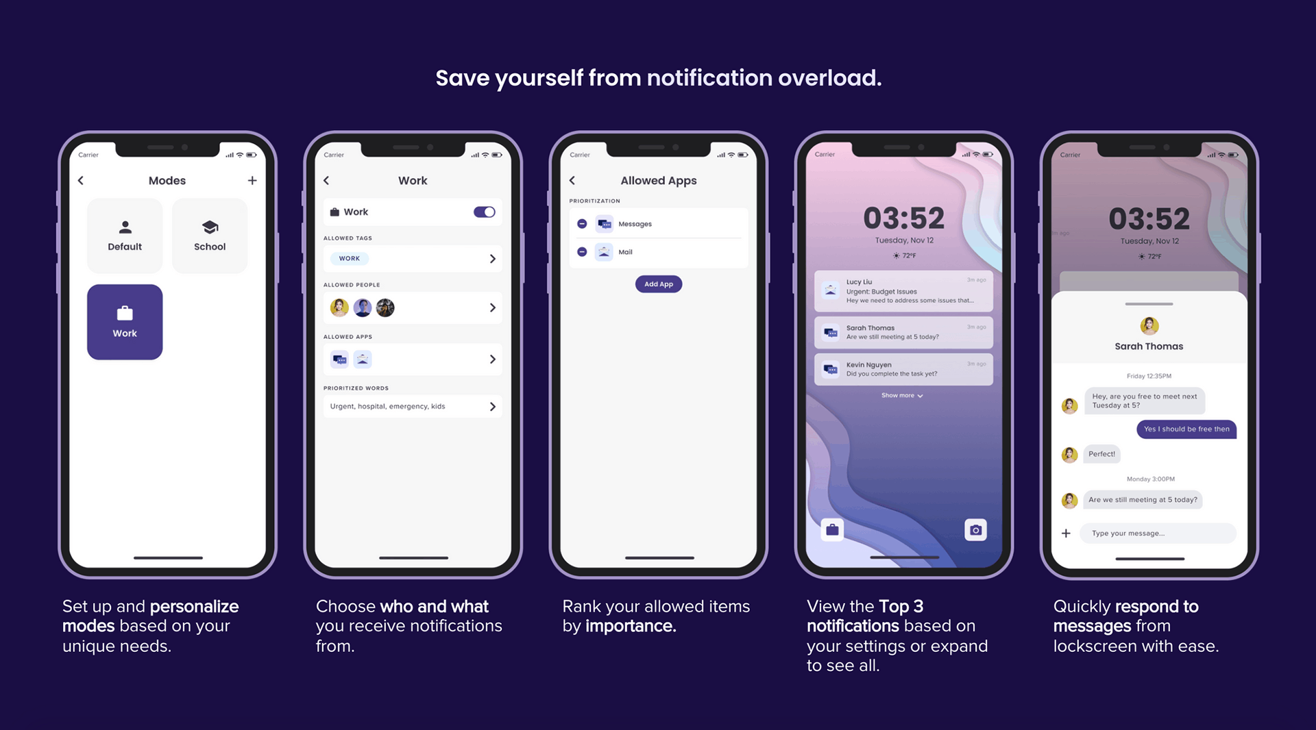
Lock Screen & Notifications
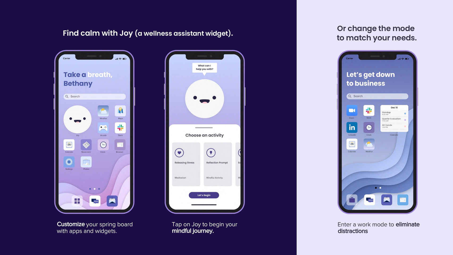
Springboard
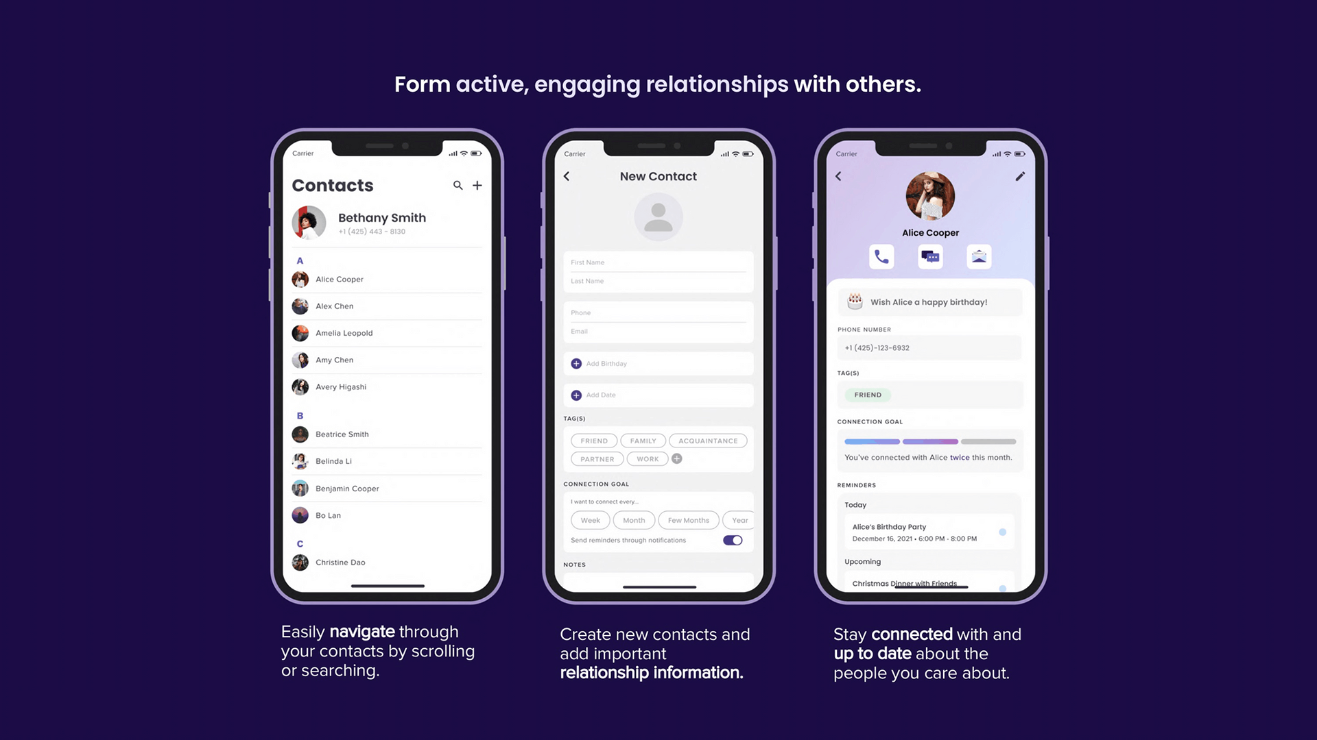
Contacts
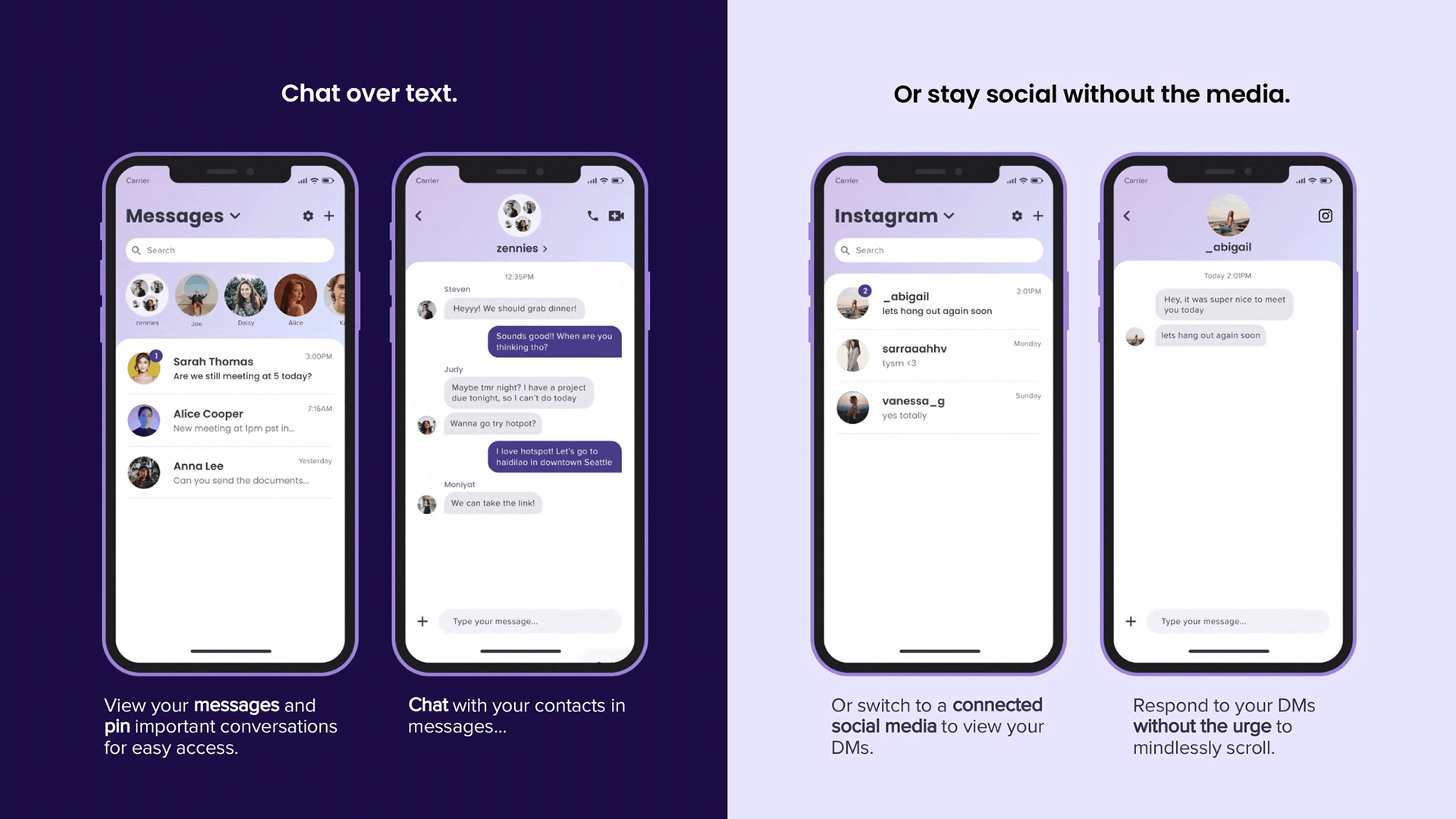
Messages
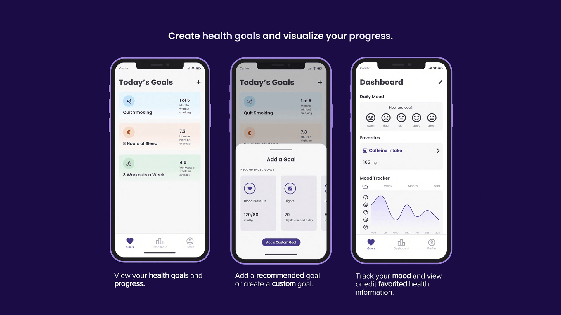
Health
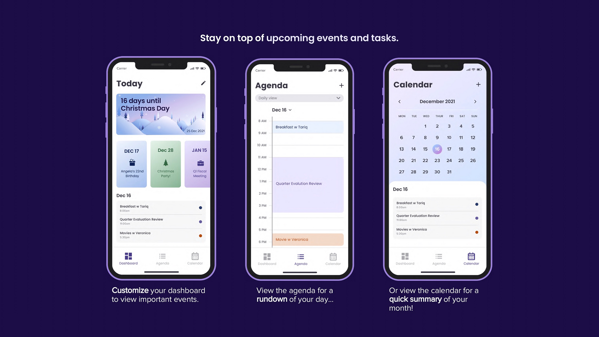
Calendar
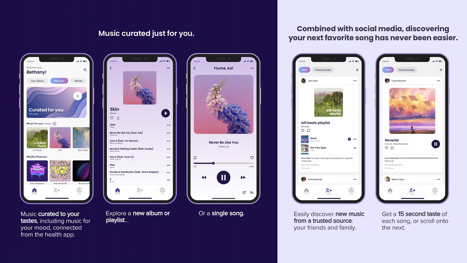
Music
RESULTS
At the end of the quarter, Brain Fling showed our pitch deck to a panel of app designers and developers to review each team's OS and rate it out of 5 stars.
Out of 5 teams of 7, we tied for first place with a rating of 5 stars ⭐️⭐️⭐️⭐️⭐️!
Here's what the judges had to say about JoyO(u)S:
REFLECTION
This was my first time designing with a team this large. It came with both challenges and benefits. It was challenging to reach agreements as there were many people voicing their opinions and as we got into the higher fidelity designs it was hard to maintain consistency even with our design language in place. At the same time though, the large team allowed for more innovative, outside-the-box ideas and more screens to be designed within the 10 weeks. I also found myself taking on a more senior designer role as our team had members of varying experiences and I was one of the more experienced designers. This pushed me to apply myself in ways I hadn't before. I often lead our design sessions, provided feedback to other designs, shared knowledge and tips I have acquired over my design career, and went back to standardize everyones' finalized work. Overall, the experience was stressful at times but it was a great learning experience and pushed me to grow as a designer.
Next Steps
If we were to continue working on the project, I would...
• Create more customization options (e.g. color palettes)
• Identify more ways to tackle addicting phone design (e.g. encouraging healthy social media consumption)
• Testing our screens with users to ensure they are enjoyable, useful, and usable
Lessons Learned
1. When stuck revisit your design principles.
While brainstorming, our team often went down the path of "what ifs" and found ourselves having insignificant discussions. We would go into the minuscule details of a feature before we even decided if a feature should be implemented in the first place. Often times when we got stuck, Brian Fling, our instructor, reminded us to go back to our design principles and ask ourselves, "Will this be useful and beneficial to our users? Does the idea embody mindful, seamless, and personalized?" This thinking forced us to make design decisions that serve a purpose and narrow down our features to ones supported by rationale.
2. Consistency! Consistency! Consistency!
I quickly learned how important even the smallest pixels when designing high-fidelity screens. During our design critiques from the instructor, he pointed out even the smallest inconsistencies in terms of spacing, icon style, text treatment, navigation menus, tab bars, and more! As time went on, I became more adept at noticing and fixing inconsistencies within our design and after looking at our overall designs I can tell how much difference attention to detail makes in making the overall experience more seamless.
To conclude, I would like to give a shout-out to Professor Brian Fling and my team for a wonderful quarter!
